After all the buzz around Google+, one of its competitors, Diaspora (free and open source) was almost forgotten. I have to admit, the same thing counts for me. In the last weeks, I've spent a lot of time on Google+ and none on Diaspora (mainly because I don't have many contacts on there (yet?), of course). Anyways, today I logged back into Diaspora and – being accustomed to Google+ – almost didn't note any difference concerning the layout.
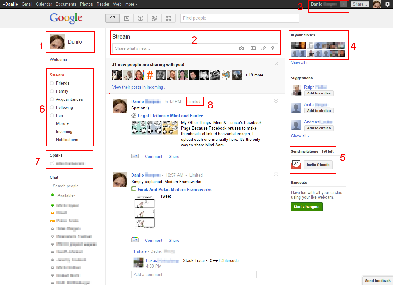
Google+
Diaspora
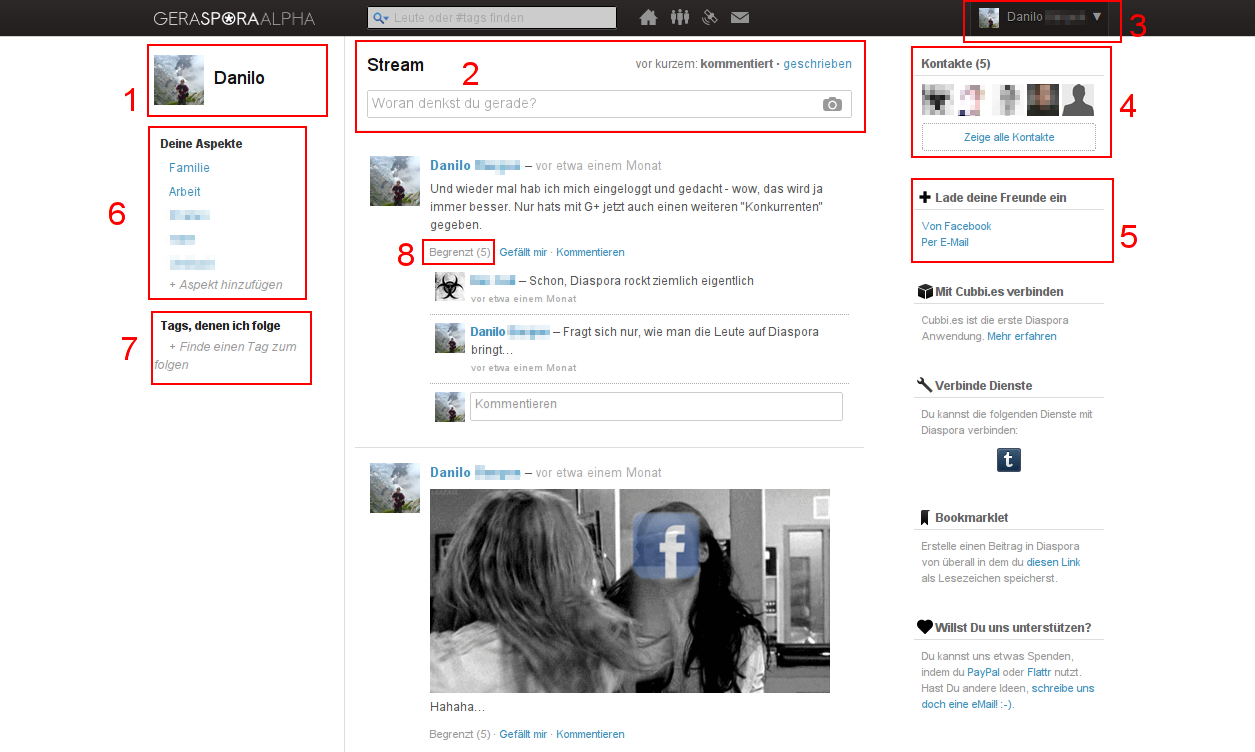
(Sorry about forgetting to switch Diaspora to English...)
List of similarities
- Avatar and first name in upper left corner
- "Stream" and a textbox with some icons (image upload) above the main column
- Avatar and full name in the header bar
- List of contact avatars in upper right corner
- Invitations below contact list
- Aspects/circles on the left, right below the name
- Tags/sparks below the aspects/circles
- Display of receiver limiting next to the post
Well...
I'm not saying Google copied Diaspora, especially as many of those things are common and obviously chosen web design elements, but Google+ certainly looks strongly inspired by Diaspora, which – as far as I remember – didn't change much of its layout over the last year or so.
Also, many ideas/philosophies behind Google+ that make it successful are almost identical to those of Diaspora. The concept of circles/aspects, the focus on sharing which information with whom, the concept of "unidirectional relationships" (following without being followed) etc...
Opinions?