Sometimes you want to see the number of registered users in your Django website over time. Fortunately Django stores the registration date of a user model instance in the date_joined field, so we can plot it.
Prerequisites
You need an installation of numpy and matplotlib. You can install the libraries using pip:
$ pip install numpy
$ pip install matplotlib
It is important that you install numpy before you install matplotlib, otherwise compiling the latter won't work. You can also use your system package manager to install them instead, if you prefer that.
Adding a Management Command
Now create a new Django management command. We could also do this as a standalone script, but by creating a management command we have easier access to the database.
$ mkdir -p <myapp>/management/commands
$ touch <myapp>/management/__init__.py
$ touch <myapp>/management/commands/__init__.py
$ touch <myapp>/management/commands/plot_user_registrations.py
Now add the following code to your plot_user_registrations.py file:
from optparse import make_option
from django.core.management.base import BaseCommand
from django.contrib.auth import get_user_model
import numpy as np
import matplotlib.pyplot as plt
from matplotlib.dates import date2num
class Command(BaseCommand):
help = 'Plot user registrations. Use --save option to save the plot to a png file.'
option_list = BaseCommand.option_list + (
make_option('--save', action='store',
dest='save', help='Save the graph as a png to the specified location'),
)
def handle(self, *args, **options):
# Get user join dates
User = get_user_model()
datetimes = User.objects.values_list('date_joined', flat=True) \
.order_by('date_joined')
dates = map(lambda d: d.date(), datetimes)
# Get some auxilliary values
min_date = date2num(dates[0])
max_date = date2num(dates[-1])
days = max_date - min_date + 1
# Initialize X and Y axes
x = np.arange(min_date, max_date + 1)
y = np.zeros(days)
# Iterate over dates, increase registration array
for date in dates:
index = int(date2num(date) - min_date)
y[index] += 1
y_sum = np.cumsum(y)
# Plot
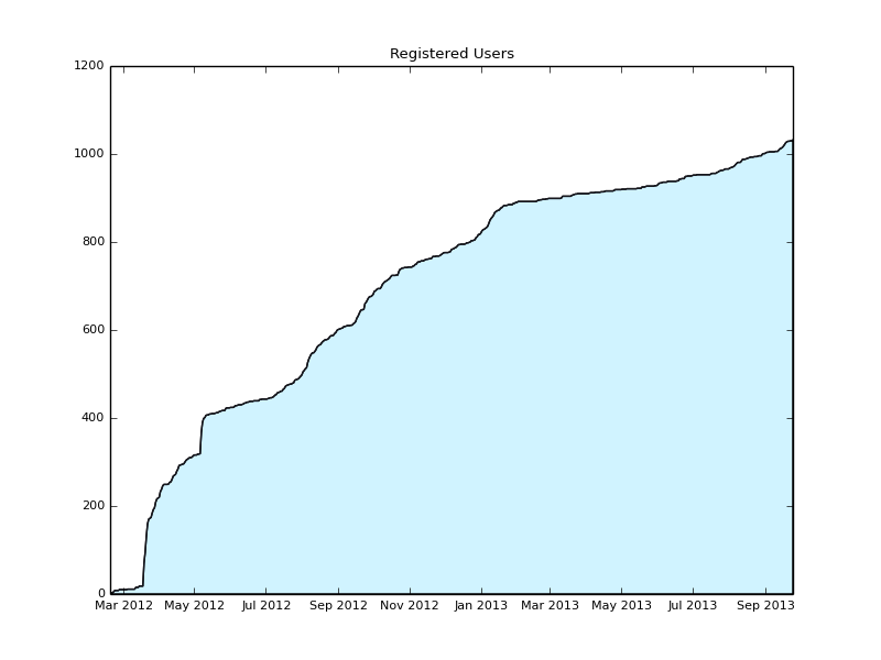
plt.plot_date(x, y_sum, xdate=True, ydate=False, ls='-', ms=0, color='#16171E')
plt.fill_between(x, 0, y_sum, facecolor='#D0F3FF')
plt.title('Registered Users')
plt.rc('font', size=8)
if options['save']:
plt.savefig(options['save'])
else:
plt.show()
Usage
Now you can call your new management command:
$ python manage.py plot_user_registrations
This will open a new window containing the plot. You can also save it to a png file instead:
$ python manage.py plot_user_registrations --save users.png
If you want, you can tweak the matplotlib configuration in order to change the plot style / colors / etc. If you find some nice improvements, feel free to leave a comment below!